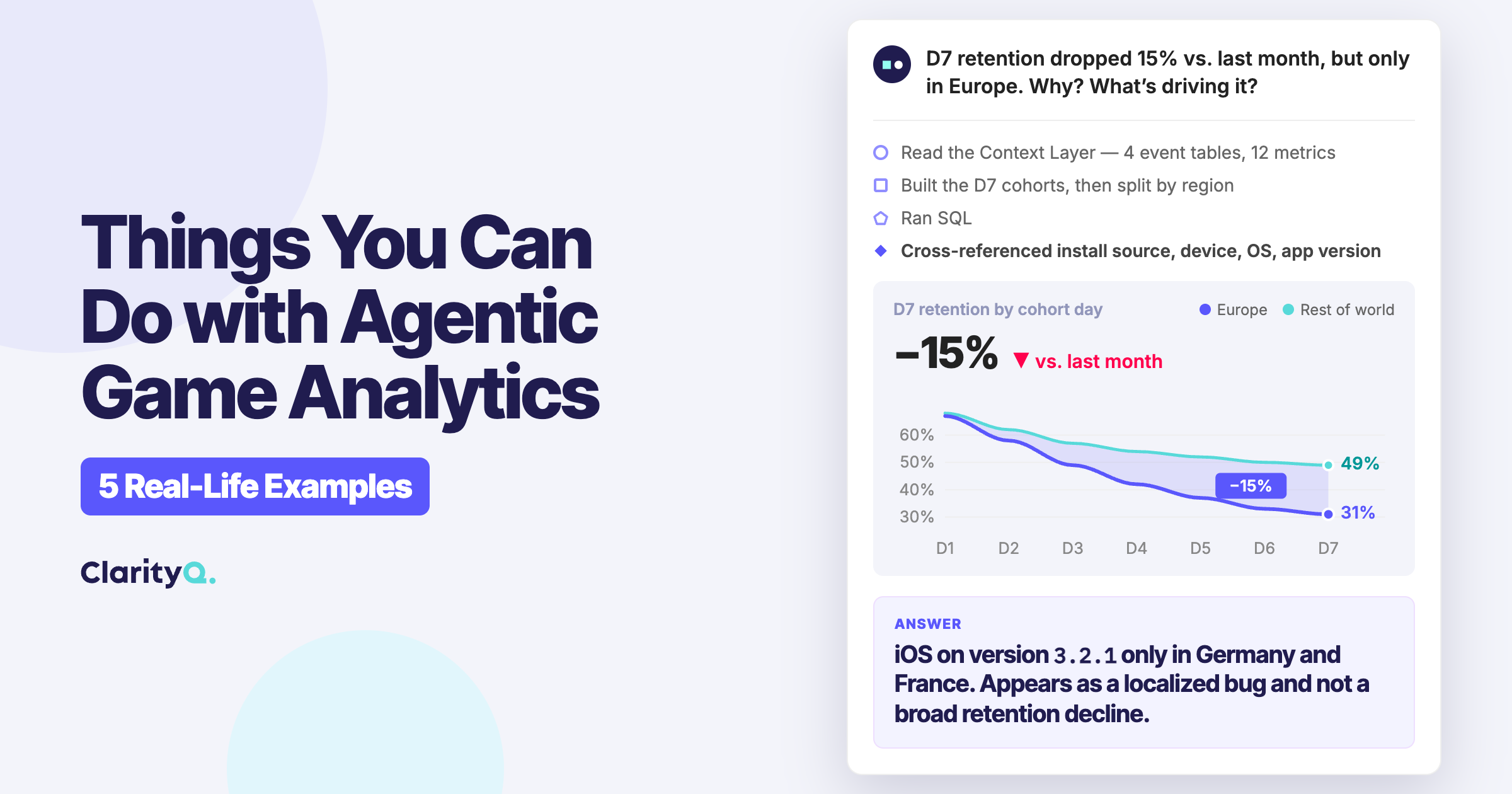
Every game team has more questions than it can answer. Retention dips, revenue shifts, a feature that may or may not be working: the questions arrive faster than anyone can write the SQL, build the dashboard, or wait out the analyst queue. So many of them go unanswered, or get answered too late to matter.
This is not a problem you can dashboard your way out of, because most analytics tools were built for reporting rather than investigation. They are excellent at showing you what they were designed to show, and they fall apart the moment you need to understand why something changed, or to compare two segments across three dimensions while controlling for install date. At that point you are back in raw SQL, four joins deep, waiting on a meeting next Thursday.
Agentic analytics is what closes that gap, but only when the agent is built for the specific shape of gaming’s behavioral data. Here is how that works, and what it lets your team actually do.
The first step is connecting to your data and actually making sense of it. The agent connects to your data warehouse, whether your data lives in Snowflake, BigQuery, Redshift, Databricks, or anywhere else, and to your BI tools, then reads through the tables, events, and fields to work out what each one means. That understanding is what it uses to build a semantic Context Layer on its own, and this is the step most general-purpose tools get wrong. To produce a layer you can trust, the agent has to be trained on gaming and behavioral metrics from the start.
The Context Layer captures how your events, metrics, features, and entities relate to one another in your business. It knows that level_complete maps to progression, that progression correlates with your D1 and D7 retention definitions, and that those definitions are measured differently across your game titles.
From there, a question asked in plain language becomes a full analysis. The agent plans the approach, writes and validates the SQL, runs it, and returns the result with complete transparency into the logic, the query, the assumptions, and the semantics it relied on. Nothing about the reasoning is hidden, which is what makes the output something a team can actually defend. And because every answer is grounded in that same Context Layer, whether it arrives in chat, as a visualization, or inside a dashboard, the whole team works from one source of truth rather than competing definitions.
When the stakes call for it, a human stays in the loop, and answers can be routed through an analyst for review before they go any further. And because every answer opens a thread, the work compounds. You can keep asking follow-ups, pivot to a new dimension, turn an analysis into a recurring automated task, save a request as a reusable skill, or push the result straight into a dashboard.
What follows are five real examples of the kind of analysis this makes possible, none of which requires writing a single line of code.
What gets asked:
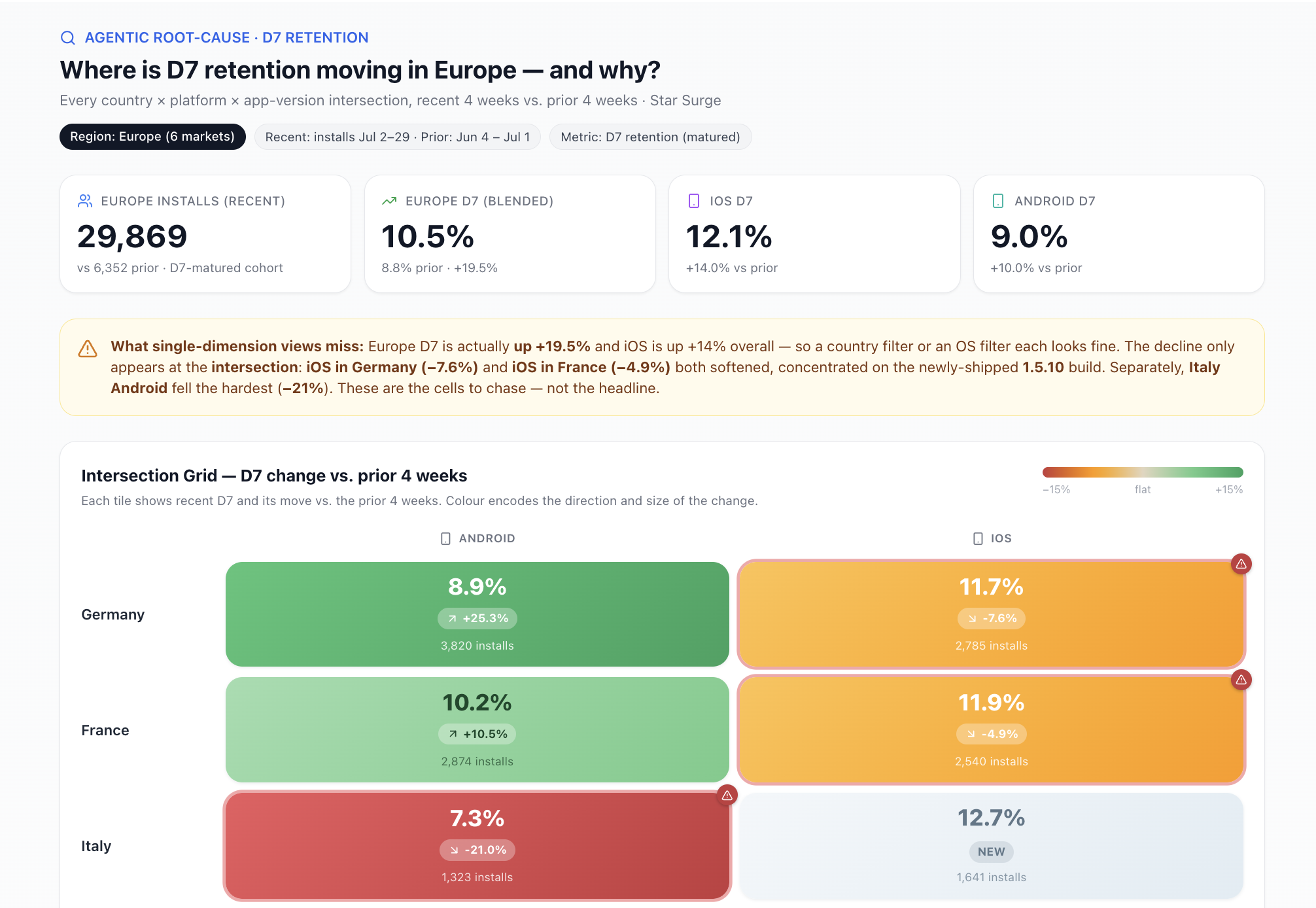
“D7 retention dropped 15% vs. last month, but only in Europe. Why? What’s driving it?”
This is the kind of question that used to take days to get answered, most of it spent waiting rather than working. Answering it properly meant running retention at the cohort level, then repeating the split by country, install source, device type, OS, and app version, and finally cross-referencing all of it by hand in a spreadsheet to find a pattern worth chasing.
Agentic analytics collapses that process. A single agent takes the whole question and runs those breakdowns across cohorts, install sources, geographies, dates, device types, OS, and app version, then surfaces the drivers that matter most. Suppose it finds the drop concentrated among iOS users on app version 3.2.1, disproportionately in Germany and France. That immediately reframes the problem as a localized bug, or an update that shipped unevenly, rather than a broad retention decline.
Where the conversation goes from there:
“Is the drop tied to a specific moment in the session, such as a level, a tutorial step, or a feature?”
“Compare the D7 retention curve for this cohort vs. the same week four weeks ago, broken down by country.”
“Which UA-source cohorts are least affected, and is organic holding up better than paid?”
Each follow-up sharpens the picture without restarting the analysis. The analyst reviews the underlying logic and signs off before anything reaches the Monday standup, so leadership receives a root cause and a remediation plan rather than another status update.
Why this matters:
A dashboard can tell you that D7 dropped, and it can let you slice by country or by OS version, one dimension at a time. What it cannot tell you is why, because the answer almost never lives in a single dimension. It lives in the intersection: this app version, in these countries, on this acquisition channel. Reaching that used to mean someone writing queries by hand, one hypothesis at a time, until the pattern finally fell out. Closing that gap is the entire point of agentic analytics: it searches the intersections for you and hands back the one that matters.
What gets asked:
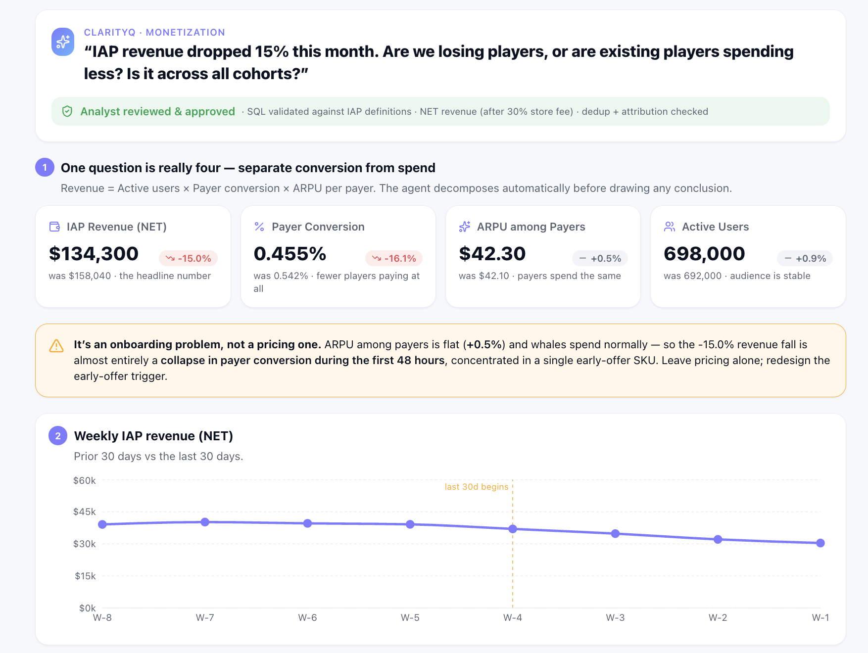
“IAP revenue dropped 15% this month. Are we losing players, or are existing players spending less? Is it across all cohorts?”
This reads as a single question, but it is really four:
Answering all four cleanly, in one place, requires joining purchase events, session events, and user profiles, with disciplined handling of deduplication and attribution windows.
The agent separates conversion from ARPU automatically, validates the raw data for inconsistencies and duplicates and corrects them where they appear, then cross-cuts the result by geography, by player cohort (new versus returning, whales versus everyone else), and by offer type. In this case ARPU is flat and whales are spending at roughly their usual level, while conversion has fallen sharply among players in their first 48 hours. That points to an onboarding problem rather than a pricing one, and the two demand very different responses.
Follow-up questions that change the action:
“Show me the purchase funnel for first-time players in the last 30 days vs. the 30 before, and where the drop-off is.”
“Which in-game offer had the biggest conversion drop, and is it across the board or one SKU?”
“Break this down by platform, iOS vs. Android, and flag any significant difference.”
“Can you find any other meaningful segmentation that helps narrow this down?”
This is precisely where the analyst loop proves its value. An analyst can spot-check the SQL behind the funnel query, validate it against the messy IAP definitions that live in real data, confirm the logic, and ask the follow-ups most likely to pay off. The monetization team is left with an answer it can act on with confidence.
What this unlocks:
A revenue report shows the same 15% drop and stops there. When revenue softens, the common reflex is a pricing move: a discount, a limited-time sale, a cheaper entry offer. But this drop had nothing to do with price. Conversion and ARPU fall for opposite reasons and call for opposite fixes, and a single headline number hides which one you are actually facing. Separating the two is what lets the team leave pricing alone, redesign the early-offer trigger instead, and skip a week of A/B tests aimed at the wrong problem.
What gets asked:
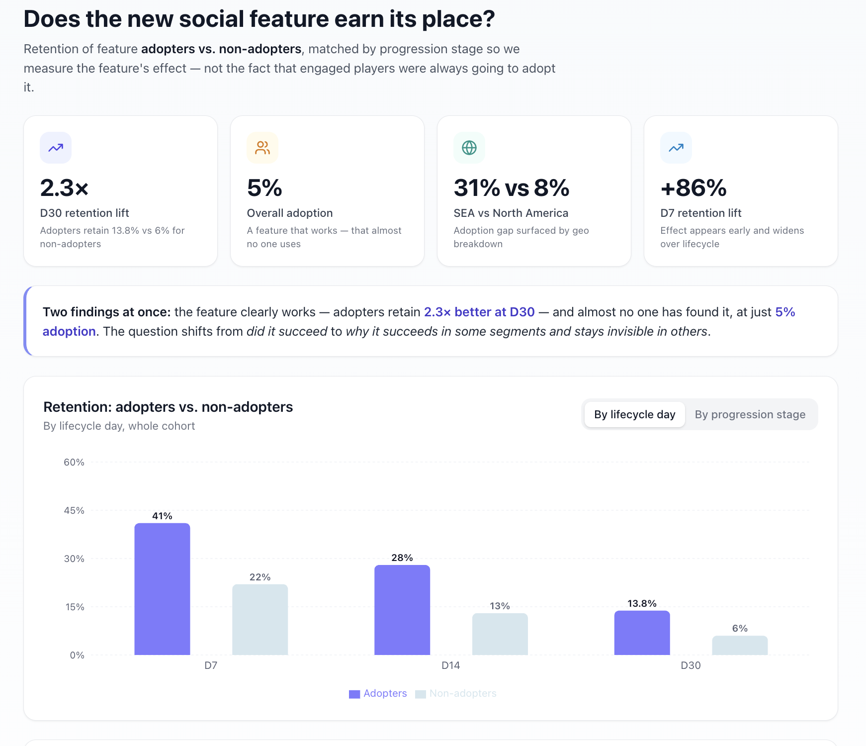
“The new social feature launched three weeks ago. Is it retaining players, or is it just noise?”
Feature impact is among the most frequently asked and least satisfyingly answered questions in game analytics. The standard response is a vanity metric, some version of “X% of players opened the new feature,” which says nothing about whether it is doing the job it was built for.
The more useful question is whether players who engage with the social feature retain better than those who do not, with everything else held constant, and at which point in their lifecycle that effect appears. ClarityQ compares D14 and D30 retention between the adopter and non-adopter cohorts, matched by progression stage across early, mid, and late funnel players, alongside other relevant parameters. Crucially, it holds those cohorts comparable, so you are measuring the feature's effect rather than the fact that more engaged players were always going to adopt it.
Suppose the result shows adopters retaining at 2.3 times the rate at D30. That is a strong signal. But if adoption sits at only 5% of the player base, you are looking at a feature that clearly works and that almost no one uses, which is exactly the kind of finding that reshapes a roadmap.
Follow-up questions:
“At what point in the session flow do players first see the invite to the feature, and what’s the drop-off at that step?”
“Which segments have the lowest adoption: new players, mid-funnel, or players who haven’t hit a social trigger yet?”
“Compare adoption of the feature by geo, device type, and demographics.”
That final question often surfaces something no one set out to look for: adoption running at 31% in Southeast Asia against 8% in North America. Depending on the surrounding context, that is a cultural engagement pattern, a localization opportunity, or a UI-placement problem, and any of those interpretations changes the conversation about the feature entirely.
The implication:
Adoption percentage, the number most dashboards would surface, would have called the feature a modest win or a modest miss and moved on. The real answer is two findings at once: the feature works, and almost no one has found it. That shifts the question from whether the feature succeeded to why it succeeds in some segments and stays invisible in others, which is the difference between cutting a feature and fixing its distribution.
What gets asked:
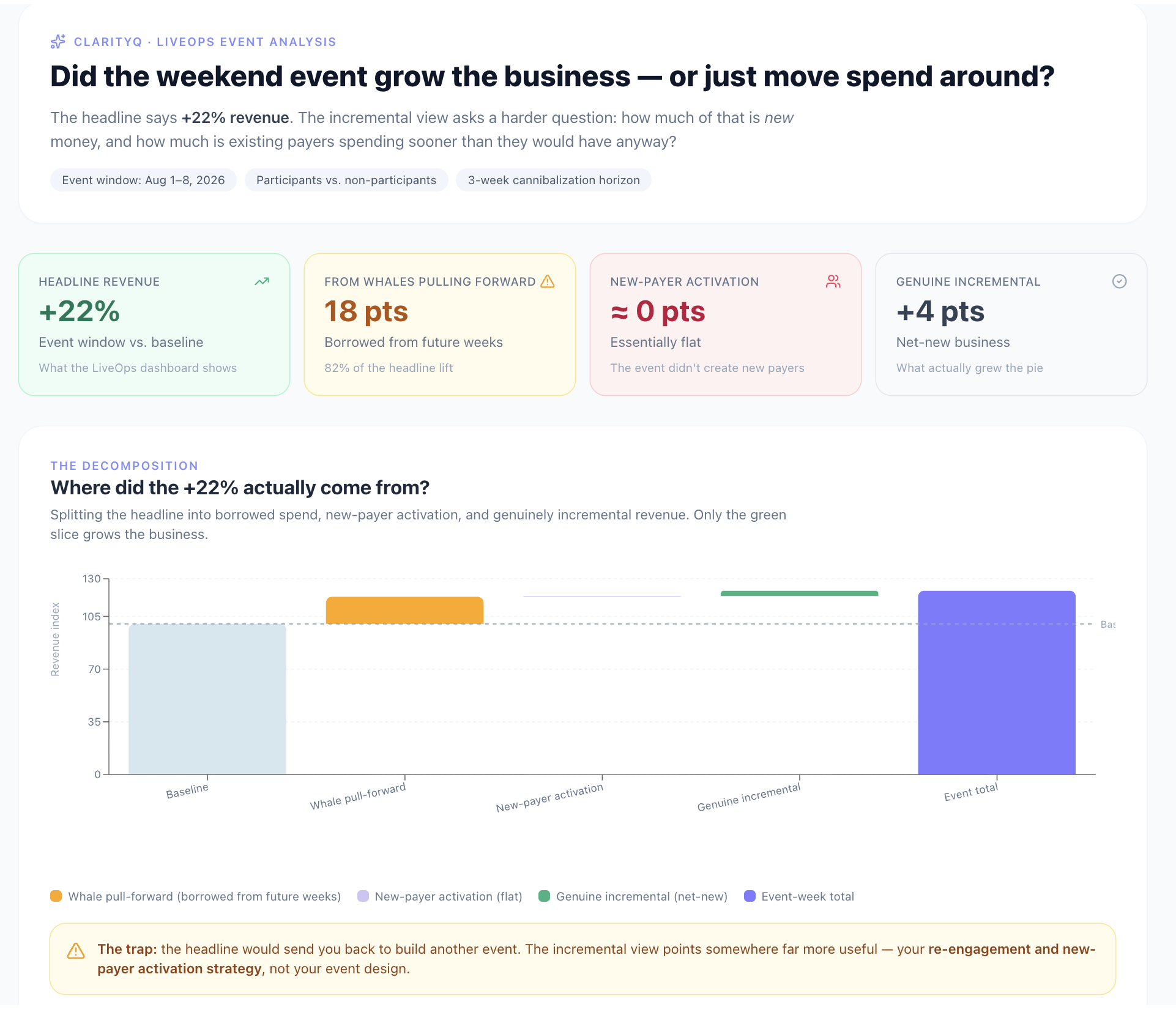
“Did the weekend event drive incremental engagement and spend, or did it simply pull activity forward from the following week?”
LiveOps teams run events continuously, and most get judged on the headline numbers: a spike in DAU, total IAP revenue during the window. Those numbers make it nearly impossible to tell whether the business actually grew or whether the event merely rearranged when players did what they would have done anyway. The risk, in other words, is quietly cannibalizing your own baseline.
ClarityQ compares session frequency, session length, IAP conversion, and ad revenue during the event window against baseline, across both participants and non-participants, then examines the following weeks to detect cannibalization. It also isolates incremental spend, the revenue from players the event genuinely activated, from spend that existing payers would have contributed regardless.
Suppose total revenue rose 22%. On the LiveOps dashboard that reads as a clear win, and the natural next move is to run the event again. But 18 of those 22 points came from existing whales pulling spend forward, while new-payer activation stayed flat. That is not a failed event, yet it is a materially different story than the headline tells, and it points at your re-engagement strategy rather than your event design. The headline number would have sent you back to build another event; the incremental view sends you somewhere far more useful.
Follow-up questions:
“Which player segment had the highest incremental spend, not just the highest absolute spend?”
“Did the event improve D3 retention for players who were in their first week when it launched?”
“Run the same comparison for our last four events and show me the trend: diminishing returns, or improving?”
The scheduling piece:
Once the team settles on the right evaluation framework, they set it as a recurring automated task in ClarityQ. Every Monday morning the recap runs and arrives in Slack or email without anyone assembling it by hand. That is the point at which analysis stops being a project and becomes infrastructure.
What gets asked:
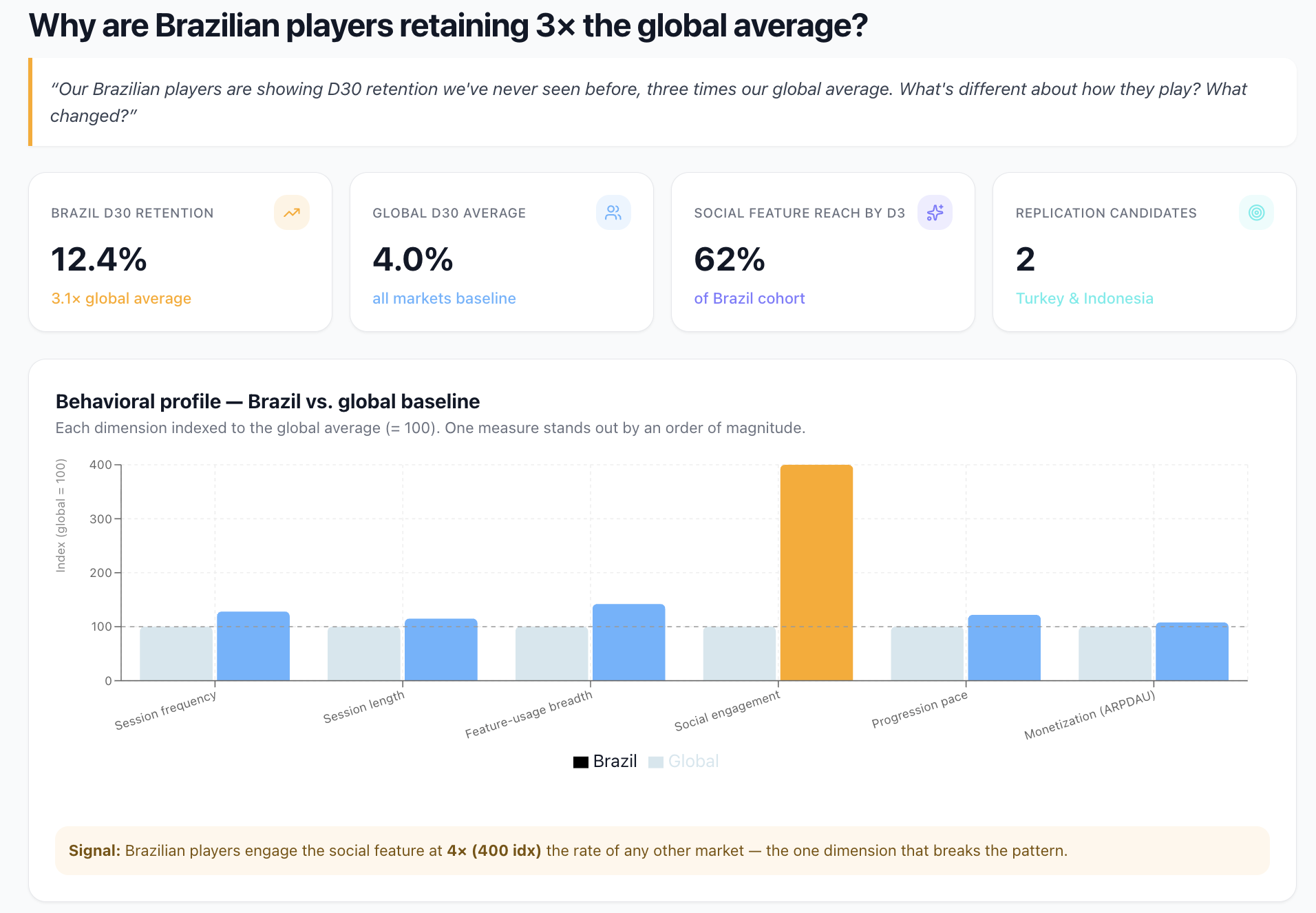
“Our Brazilian players are showing D30 retention we’ve never seen before, three times our global average. What’s different about how they play? What changed?”
Although teams spend most of their time fixing what's broken, they will dig into a standout win like Brazil's when one appears. The difficulty is that doing it properly is a heavy, manual investigation, so it gets reserved for the biggest surprises and still takes time to turn around. And understanding why something is working can be higher leverage than diagnosing why something broke: pin down what actually drives a win like this, and you can engineer the same outcome in other markets rather than simply admiring it.
ClarityQ assembles the full behavioral profile of the Brazilian cohort and sets it against the global baseline across session frequency, session length, feature-usage mix, social engagement, progression pace, and monetization behavior. It finds that Brazilian players reach the social feature at four times the rate of any other market, and by D3, before players in most other markets encounter it at all.
Follow-up questions:
“What’s triggering discovery of the feature so early for Brazilian players: a referral pattern, a specific UA source, a cultural difference, or something in the session flow?”
“Which other markets have a similar social-engagement profile, and which are the most likely candidates for this pattern to replicate?”
The second question is where the real value sits. ClarityQ identifies two other markets, Turkey and Indonesia, whose players show the same underlying appetite for social play and comparable session behavior, but where adoption of the feature sits at just 9%. They have Brazil's ingredients without Brazil's result, which makes them the natural place to run an experiment.
What the team does with this:
They design a targeted onboarding change, surfacing the feature's invite two steps earlier, and roll it out first in Turkey and Indonesia as a test, with a hypothesis grounded in observed behavior rather than intuition.
Why this is hard to reach without agentic analytics:
Reaching this insight means correlating retention, feature usage, session sequencing, and geography across a single cohort, then running a similarity match against every other market while normalizing the samples. It is exactly the kind of multi-step investigation no one has the bandwidth to run on a hunch, so the win stays invisible and the growth it points to is quietly left on the table. Debugging a problem always feels urgent; understanding a success rarely does, which is why almost no one gets to it. Making that investigation cheap enough to run on a whim is what turns a lucky outlier into a repeatable playbook.
These are only a handful of the questions we see gaming teams working through every day. If a comprehensive list of questions and follow-ups would be useful, reach out and we’ll share it.